Adding video to a landing page keeps potential customers on your site longer, gives them valuable information about your product, and can increase conversions. But there are also some challenges to think through when making a video landing page for your business, including:
- Planning, recording, and editing the video content can be technical and time-consuming, and the alternative — hiring a video team to do it for you — is often prohibitively expensive.
- Creating a video landing page can be technically challenging, especially if you’ve never logged into the back end of your company’s site builder before.
- Choosing the right layout can feel like a juggling act, and the wrong structure can lose the viewer’s interest before they sign up.
Here, we’ll show you a better way to create and publish testimonial videos that are perfect for your company’s landing pages. Whether your goal is to increase lead generation, get more applications, or boost your sales, our tool — Vocal Video — makes every aspect of the video creation process quick, intuitive, and affordable.
In this article, we’ll...
Ready to create engaging, high-converting video testimonials about your product or service? Sign up for Vocal Video today.
What Makes a High-Quality Video Landing Page?
No two landing pages are exactly alike, and the copy, design elements, and video content you choose depend on everything from your brand voice to the product you’re selling. But the ingredients of a landing page that increases conversion rates are almost always the same.
Here’s a quick example of a video landing page:
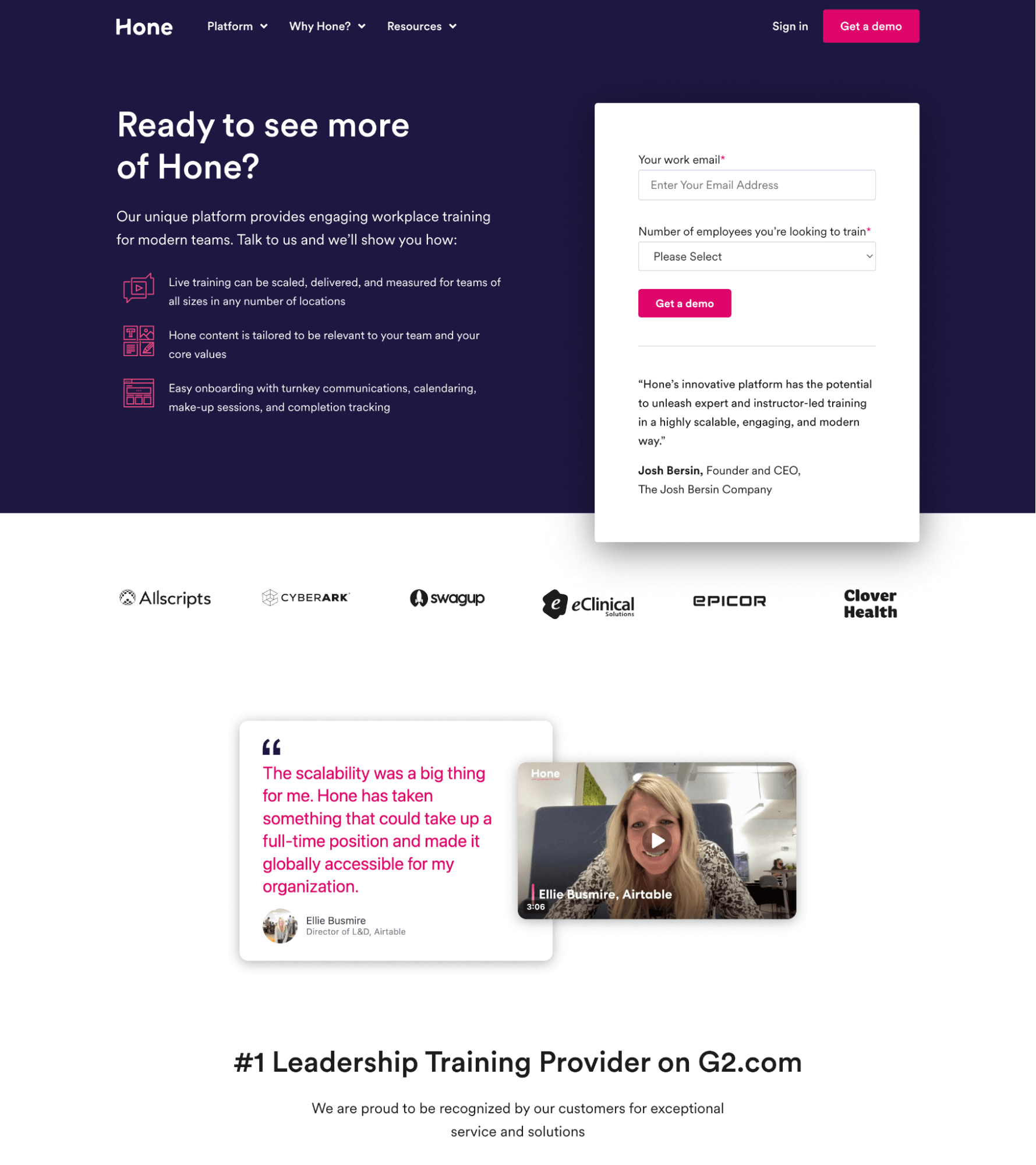
Clear Goals
Successful landing pages are structured to achieve one objective, which makes them much more specific than other parts of your company’s site. For example, some landing pages are designed to intrigue the reader and build trust so they get a demo (like the landing page example above) or add their contact information to a mailing list. Others may be targeted to potential clients closer to the bottom of the funnel, where you can make a harder sell and convince them to commit — for example, by signing up for a product, service, or attending an event.
In all cases, your landing page should highlight the benefits other customers have seen and give some data to support your claims. The way you lead the reader through the information, the details you emphasize, and the examples you choose will change according to the page’s goals.
Problem Solving
The best landing pages answer the common questions readers have as they research your product, service, or company. If you have a clear idea of your potential customer’s pain points, you can build your landing page to showcase how your product answers those frustrations. When you give your customers data to answer the objections they might have (for example, around the cost or reliability of your product), they’re more likely to say yes by the time they get to the call-to-action at the bottom of your landing page.
A Compelling Call-to-Action (CTA)
Every element of your landing page should funnel the reader toward a clear call-to-action that’s hard to say no to. The most effective CTAs are descriptive, active, and customer-focused. For example “Kick off your project” can sound more exciting and inviting than “Work with us” because it keeps the reader in control. The call-to-action, or the copy surrounding it, should also clarify exactly what you want the reader to do next.
If you consider how to approach these elements when you first start building your landing page, it’s easier to tell a clear story, make a connection, and hold the visitor’s attention until they’re ready to buy in. You’ll improve the user experience for your visitors, and close more sales.
These video landing page examples from Fingermark are a great example of video marketing in recruiting:
The goal of the video gallery is to convince more people to apply for the open roles at your company by showing a strong team of satisfied employees.
So, these videos…
- Support the primary call-to-action at the top of the page (“Come work with us”) by letting the employees explain why a potential applicant should join their team.
- Show a group of people in diverse roles and backgrounds, working cohesively as they speak from their office — with consistent company branding.
- Put the employees front and center in marketing, showing that the company values their opinions and giving relatable evidence that it’s a great place to work. This authenticity is matched by the informal “Get in touch” button above the videos on the page.
Now, let’s look at how to create landing page videos like these for your company.
How to Create a Video for Your Landing Page — Step by Step
Vocal Video is an end-to-end video creation tool designed to help businesses gather testimonials from their customers, clients, and employees. These insightful videos are the personal stories of what makes your company unique, so they’re a perfect resource to support your sales copy and help your landing pages convert.
Vocal Video uses URL-based remote interview collectors and a cloud-based video library to make it effortless to ask for, record, and edit video testimonials. What’s more, you can access all the benefits of testimonial videos — and add the content seamlessly to your landing pages — with no prior experience in film production or web design.
Here’s how the process works:
Create a Video Collector
The Video Collector is the interface that guides your respondents as they record their videos. When you set up a collector, you write the interview prompts that shape the content of the finished video. So, with the goals for the landing page in mind, start by deciding on the questions you want to ask.

Read our Sample Questions for Video Testimonials.
Good landing page videos show the target audience the practical benefits of working with your company. Alongside data such as survey results, stories about how someone has experienced your product or service can convince viewers that they’ll see the same positive results when they sign up. The challenge with a landing page video is to show all this information while getting straight to the point — and all without making it feel like you’re putting words in your respondent’s mouth.
To make things easier, every Vocal Video Plan includes access to our library of over 45 industry-specific Video Collector templates, which come with pre-written questions that are customizable.
For video landing page templates, we recommend:
Whether you use a template or build your collector from scratch, you can follow the steps in the Vocal Video dashboard to write a welcome message, ask for information to credit the person giving the testimonial, and thank them for their time.
You can even add an incentive for the people who record a response.
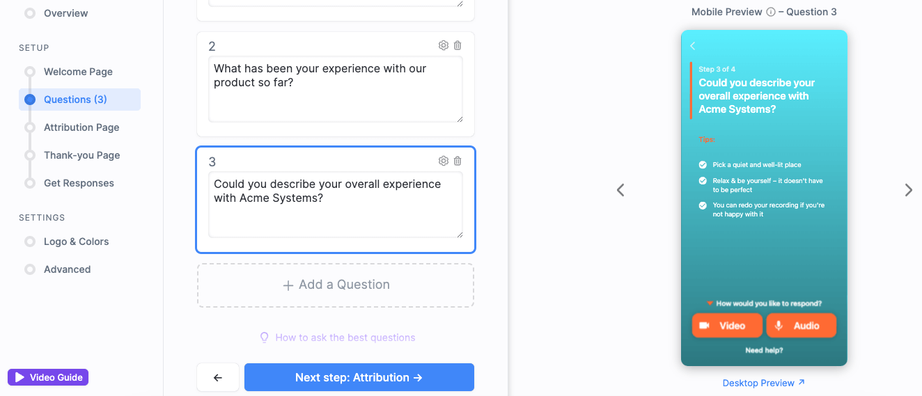
When you go to the “Logo & Colors” settings, you can add your branding to the collector. We’ll also include these branding features automatically in the finished video.
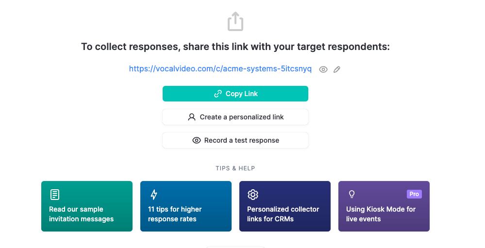
Once you’re happy with the questions and the way your collector looks in the preview, click “Get Responses” and generate the link you need to send to potential respondents.
Edit Your Landing Page Videos
Whenever a customer or employee opens your Video Collector and records a testimonial, their response is sent to your Vocal Video library. Our automatic editing process — included in all Vocal Video pricing plans — stitches the respondent’s answers together and adds design elements to make your video stand out online. So, when you get the notification that there’s new content in your library, all you have to do is check it, tweak it, and publish it.

Our automatic editing takes care of most of the features that landing page videos need to be accessible and effective, including…
- Brand elements
- Attribution information
- Music to set the tone
- Subtitles
You can also use our suite of editing tools to replace any of these elements or to make other changes that make your video perfect for a landing page.
Within Vocal Video, you can:
- Trim the videos or select your favorite questions to repurpose a longer video interview into a short and sweet landing page clip.
- Add more text or video slides — for example, to include a call-to-action telling the viewer what to do next.
- Change the aspect ratio of the video to fit the layout of your landing page. For example, a hero video at the top of the page might look best in landscape format, but for a video further down the page, a square format or a portrait video card might fit better around the other design elements.
And if you ever want to share your testimonials on social media or in email marketing campaigns instead of on your landing pages, these tools make it easy to repurpose your content and share it in every part of your marketing strategy.
Optional: How to Create a Video Card or Gallery

Our research shows that marketing campaigns that use video see a lift in conversions compared to those that don’t because it’s a form of authentic social proof.
Testimonial videos consistently convert because they show prospective customers or potential leads that people like them have already seen the benefits of working with your company, helping them to imagine themselves in the same position.
When it comes to social proof, more is often better, so many companies aim to build their landing pages around a gallery of testimonials.
Vocal Video makes it effortless to build horizontal testimonial carousels and slideshows (for landing pages designed for the reader to scroll through multiple pieces of convincing information), and larger walls of love (for landing pages where the voices of the existing clients or employees are the foundation of the argument).
Our customer Velocity Resource Group uses a grid gallery on their recruitment landing page:
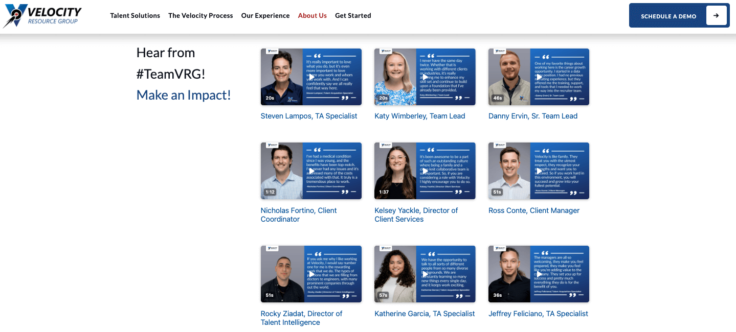
To build a gallery like this…
- Go to “Create a Gallery” and choose the format that suits the layout of your page.
- Add a selection of your published videos by clicking “Add to Gallery” under your favorite responses.
- Drag and drop the videos in the gallery to change the layout, with a live preview to show you how it’ll look on your site.
- Automatically generate the embed code to publish the gallery.
If you don’t have enough videos to create a gallery, you can still build a more intriguing video element for your landing page by making a testimonial card. These showcase the thumbnail of your video alongside an attention-grabbing pull quote from the transcript.
For example, our customer Emplicity uses a video card just above the call-to-action on their homepage:
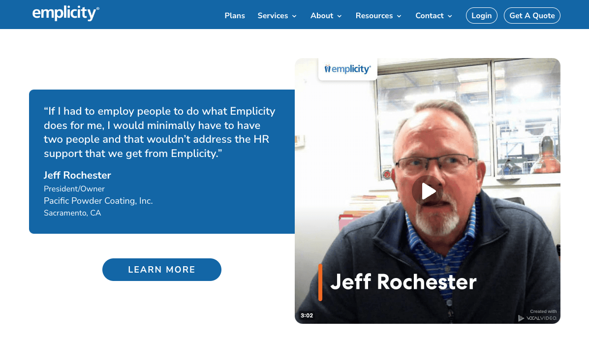
To make a video card like this…
- Go to a published video and click “Embed”.
- Select “Video Card”.
- Adjust the “Card Type” to change the placement of the quote, “Content” to choose your favorite quote, and “Design” to change everything from the colors of the text to the shadow on the corners of the video.
- Automatically generate the embed code to publish the video card on your site.
How to Effortlessly Add Videos to Your Landing Pages
With Vocal Video, you can easily turn success stories from your customers and your team into the memorable, relatable content that helps landing pages drive higher conversions. What’s more, we generate the HTML you need automatically, so all you have to do is copy and paste to embed a video or gallery on any page of your site.
Whether you’ve made a standalone video, a video card, or a gallery, go to “Publish” and then select “Embed it on your site.”
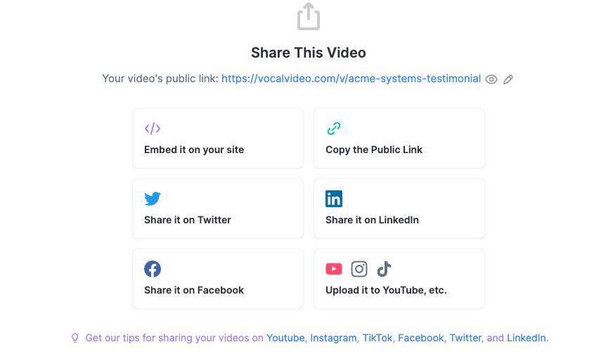
You’ll then be prompted to make any final changes to the video’s appearance and choose how you want it to play (if you want a hero video on your landing page to playback automatically when the page opens, select “Autoplay” here).
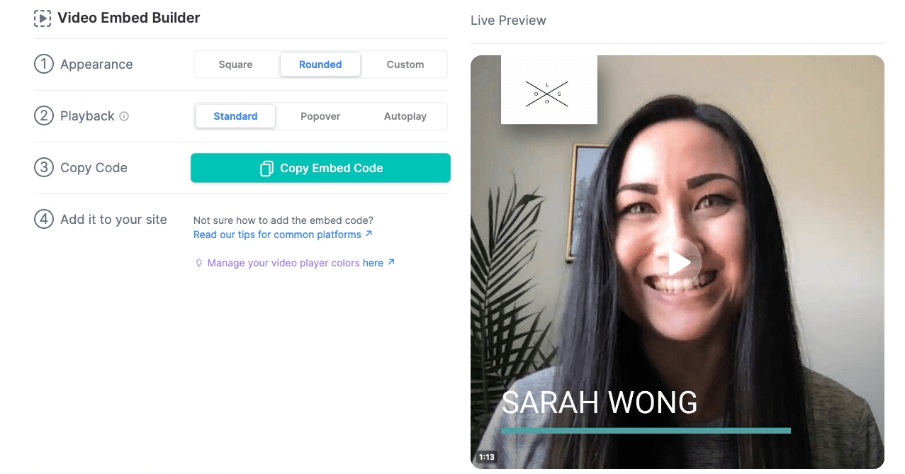
Then, just click “Copy Embed Code” to pick up a snippet of HTML to drop onto your page.
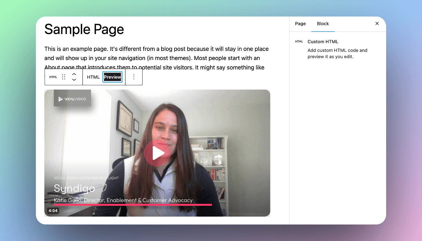
Next, open up your site builder. For example, let’s look at how to add a video testimonial to a landing page in WordPress. For most WordPress sites, all you have to do is add a new block to your page and define it as a “Custom HTML” block.
Paste the code from Vocal Video into that block, save the changes, and refresh your page to see the published video.
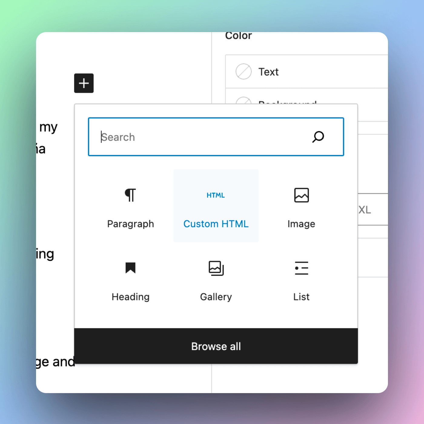
This process is very similar on site builders like Squarespace and Wix, where you can also create a code block or custom element to turn into an embedded video or gallery.
Vocal Video’s embeds work for most sites (including Shopify, HubSpot, ConvertKit, etc).
You can find more tutorials on how to use your embed codes here.
As well as being easy to do, adding Vocal Video testimonials to your landing pages has a host of SEO benefits that can help more people discover your page. These include…
- Increasing “dwell time” — the number of seconds a visitor spends on your page — which can signal to search engines that your content is relevant and useful to future searchers.
- Using a cloud of keywords related to your company, attracting more people who are searching for a solution your product could potentially provide. You can double down on these related keywords by publishing the transcript of the video or using featured quotes.
- Acting as positive reviews that give your product credibility, increasing the likelihood that someone will click on your site when it appears in their search results.
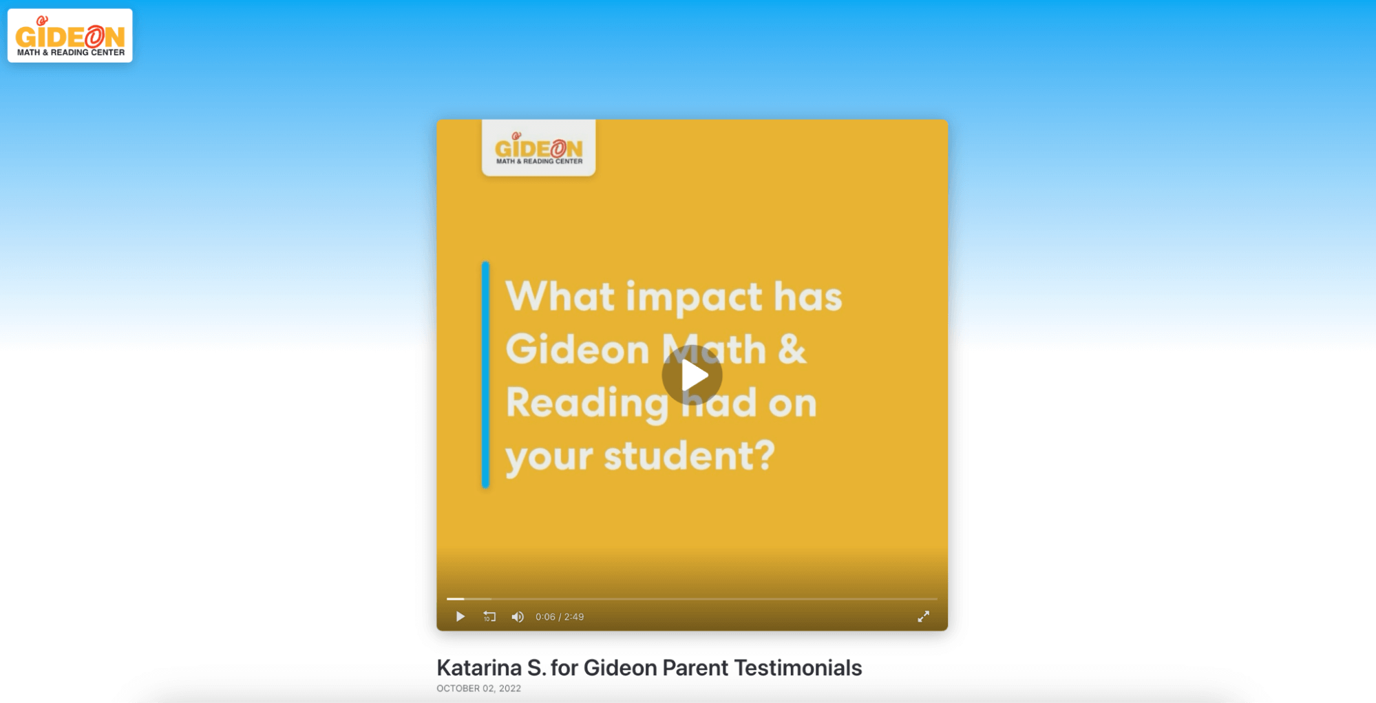
And as all your published videos come with ad-free video hosting on a public Vocal Video page, your content also gets a boost from our domain authority. For example, when someone searches “[your company] experiences” they may be shown the testimonial on its public page, which includes your logo and brand colors — like this public page for Gideon Math & Reading Center.
Read more about the benefits of testimonials for SEO and how to optimize your video marketing content.
3 Great Examples of Landing Pages Made with Vocal Video
Now, we’ll look at three types of video landing page designs from our customers.
Case Study #1: Slideshow Gallery on a Landing Page
LivePerson uses a gallery of employee generated videos about halfway down a landing page designed to showcase their company culture and open roles.
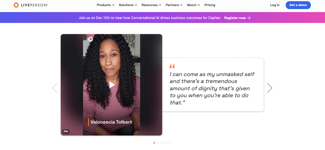
This gallery is effective for a few reasons.
First, the horizontal layout means the gallery takes up the same amount of space as other information points — like the locations of the offices, the company’s values, and the awards they’ve won. For a gallery designed to be an element of the argument, but not the entire focus, this is the perfect layout to choose because it means that the company can include this wealth of information without throwing off the balance of the page.
Second, the interactive play buttons and video card designs counteract short attention spans, grabbing the viewer’s attention as they scroll through the information, making it more likely that they’ll stop and watch an employee story. Even if they do just continue to the bottom of the page, the pull quotes give the key points that the company wants them to take from the gallery.
Finally, the gallery is placed after the raw facts that should answer the questions the reader has before they apply (for example, “Can I work remotely?” or “Will I have access to the benefits I need?”). Once their objections are mostly answered, the reader comes across the testimonials, which support the facts by making an emotional connection with the potential applicant. This can give them the final push they need to apply for the role.
Case Study #2: Introducing Team Members with Single Videos
Advance Local uses a single employee testimonial video toward the top of their careers page.
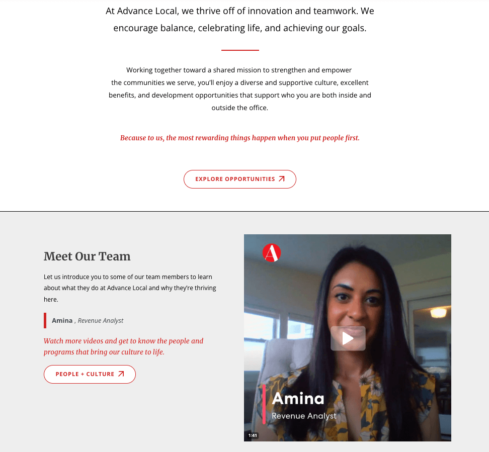
This landing page video is effective because it acts as an introduction to the company. It sets the tone of the page and makes the reader feel welcome. They’re introduced to Amina on a first-name basis, and this down-to-earth tone continues to the end of the video, with a “Thanks, Amina!” from the company on the final slide to show how much they appreciate her contribution.
The video covers several of the questions a potential applicant might have as they research the company, such as how well the team communicates and what their work will actually involve. Plus, they hear this from an established employee, who has already been in the role for 10 years, which suggests that it must be a good place to work.
These choices balance openness and professionalism — an ideal combination in the eyes of the potential employees watching. It also makes them feel at ease, so they’re more likely to take in the rest of the information about benefits and company culture as they scroll the rest of the page.
The CTAs at the bottom of the page include phrases like “Find your team” and “Explore opportunities” to tie together the company’s values that Amina described in her video. All of this makes the reader feel confident in submitting their application.
Case Study #3: Company Culture Gallery for Clients
Mobica uses a gallery of stories from their engineers to introduce the people their clients might be working with.
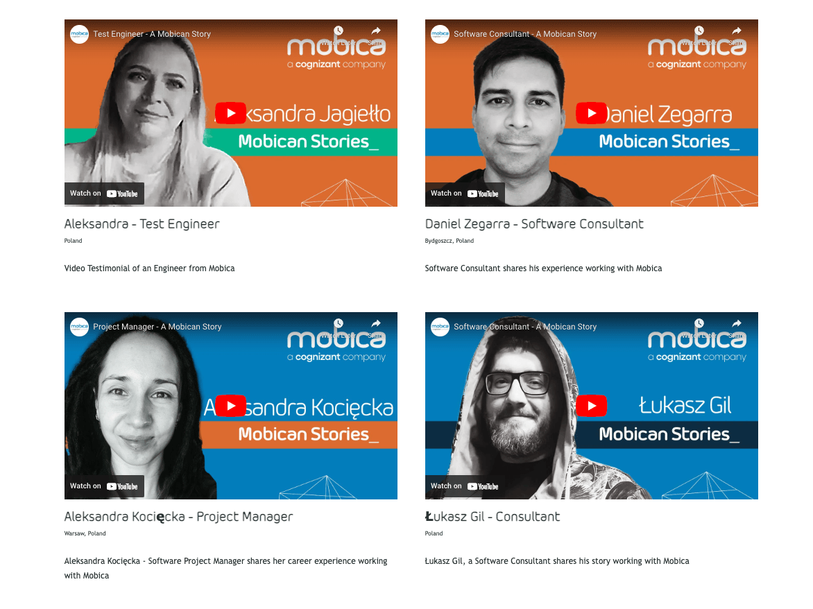
These videos (with introductory video clips and thumbnails made by and uploaded to Vocal Video by Mobica’s designers) give short bios for each of the team members.
On this landing page, the testimonial gallery is the main content, and every video supports the claim that the company’s engineers have the deep knowledge of software engineering that can help their clients achieve their business goals. The grid layout gives each video equal weight and encourages the visitor to scroll through multiple stories, so they get a sense of how talented the team is. When they’re convinced, the call-to-action button (“Get talent now”) is as confident and decisive as the speakers.
Because Mobica uses so many testimonials, they’ve chosen to shake things up by using different questions in several videos. For example, some people answer the prompt “What does your job involve?” while others summarize what they do. Some answer “How is working with Mobica different from other companies?'' while others answer “What do you think clients would say about Mobica?” This final question is particularly effective in a gallery designed to be viewed by other potential clients.
Although there are plenty of variations between the videos, they’re also unified by the brand’s colors, the opening and closing graphics, and the call-to-action at the end of each clip.
Easily Create Your Own Video Landing Page with Vocal Video
Adding video to your landing page is one of the most reliable ways to connect with visitors and lead more people to your call-to-action. Whether you want to introduce a single video element or build your page around a beautiful testimonial gallery, Vocal Video is the only tool you need to collect, edit, and publish videos effortlessly to your own site.
With Vocal Video, you can…
- Get compelling, authentic testimonial content from your customers or team with customizable Video Collectors.
- Brand your videos effortlessly with our automatic editing features.
- Build beautiful testimonial galleries to suit any landing page layout.
- Update your landing page in seconds with our automatically generated embed codes.
Sign up for your free Vocal Video account to start creating landing page videos and galleries today.